Tehama Wayfinding Project
Programs Used: Adobe Illustrator, Adobe InDesign
Objective
Design and test a new wayfinding system for Tehama Hall located at California State University, Chico.
Description/Research
For this project I was put into a group of three where we were assigned to address the signage issue in Tehama Hall on CSU, Chico. We researched the current signage and came up with concepts we thought would improve the signage for Tehama. I contributed in developing the concepts for office signs, regulatory signs, department signs and the two college signs.
Strategy/Solution
My group members and I used our own observations and those of others to find out the common problems associated with the current way-finding system of Tehama. We took pictures within the building and found that there were paper signs scattered throughout the halls and none that really stood out. There was no central map and the office signs had no consistency. From these findings we set out to develop a new way-finding system that had proper labeling, is ADA Compliant and is consistent. We created a central kiosk and concept signs for the two different colleges in Tehama, office signs, department signs and even regulatory signs. Once we built various prototypes, we tested them and gathered feedback from faculty and other students. From the feedback we got, we then made revisions to our way-finding system. The overall feedback from both faculty and students was overwhelmingly positive and really liked the consistency from our system.
Concept Development
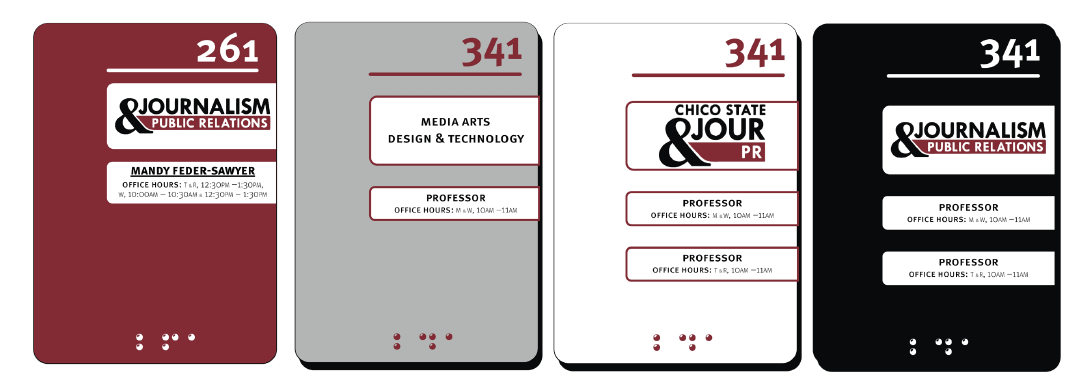
Using Adobe Illustrator, I wanted to have a layout for the office signs that was both visually appealing using the university colors and modular. So from looking at different types of office signs online I was inspired to create this where the department and professor names are printed on paper and can be swapped out of the sign every semester if information is changed.
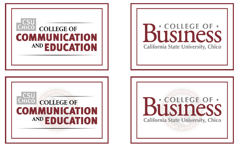
For the college signs I found that they have their own logo so I wanted to put their logos on a what background and make that their sign. I have one concept with the university seal as a watermark and one concept without it.
I wanted to keep that same consistent look for all my signs.
Refinements
I settled on this office sign as opposed to the others and added the university flame as a watermark for the department signs as well as bold the department name. I kept the other signs I made the same.
Lessons Learned
For any signs when I’m incorporating the logo. It was difficult to recreate it, because I didn’t have the actual file of the logo so it originally came up blurry. Luckily, I was able to recreate the logos and they’re nearly identical to the ones in Tehama. I also had to be very carful when creating the actual prototype signs because the foam boards were a pain to cut and in the future I would like to use different material.


